The Color Kittens
publishing, illustration, print design
Art Direction: Paul Kepple
Overview:
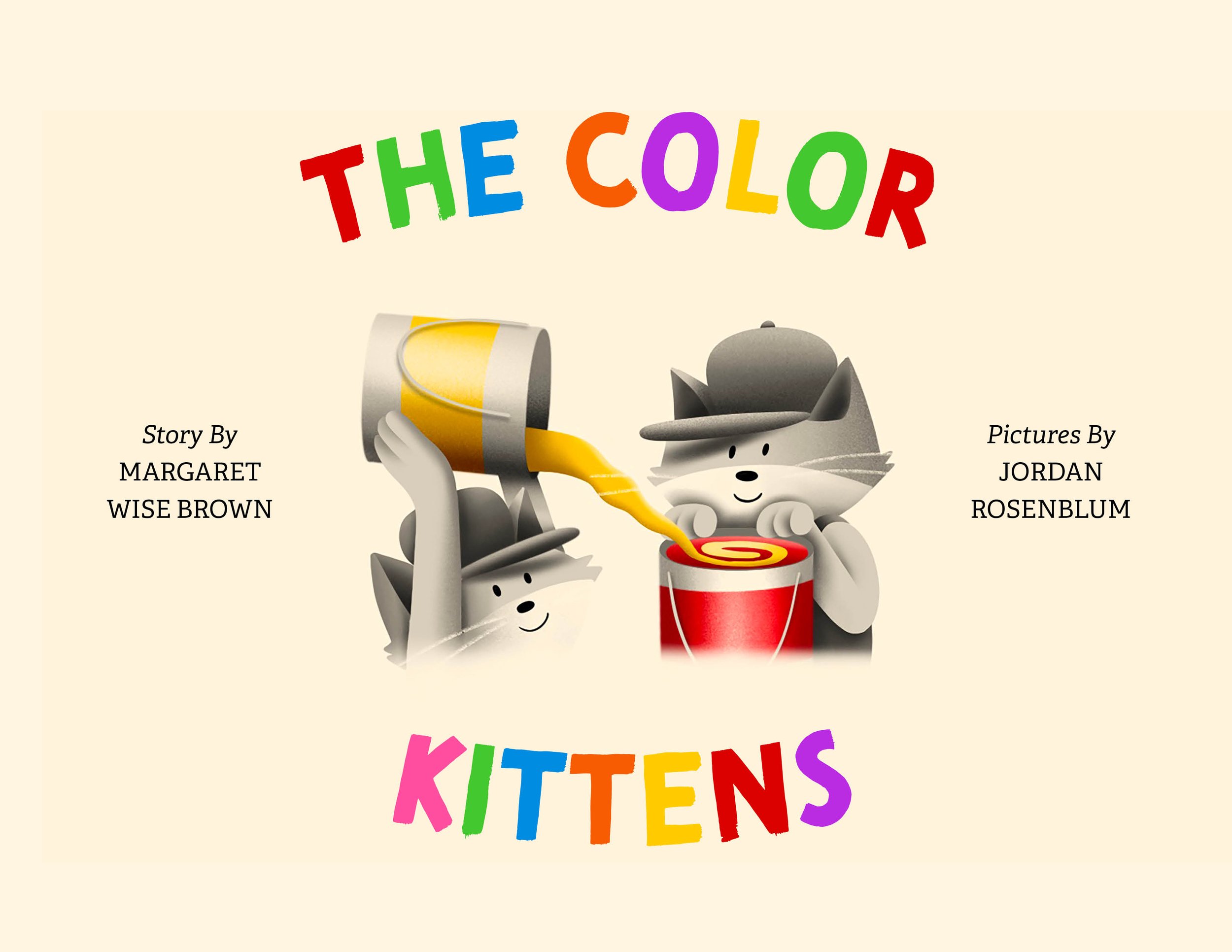
Margaret Wise Brown's popular children's book, The Color Kittens, is the rollicking tale of two kittens, Brush and Hush, who love to paint everything in sight with their "buckets and buckets" of color. There's only one problem. They have no green paint! By mixing their paint colors, the kittens make many colors before finally making green.
Every Thursday afternoon, my grandmother would come over to watch my sister and I, and during each of her visits, we would read this book cover to cover. This past year, I designed, illustrated, and bound my own recreation of The Color Kittens in memory of my late grandmother and her role in supporting me as an aspiring young artist.
Challenge:
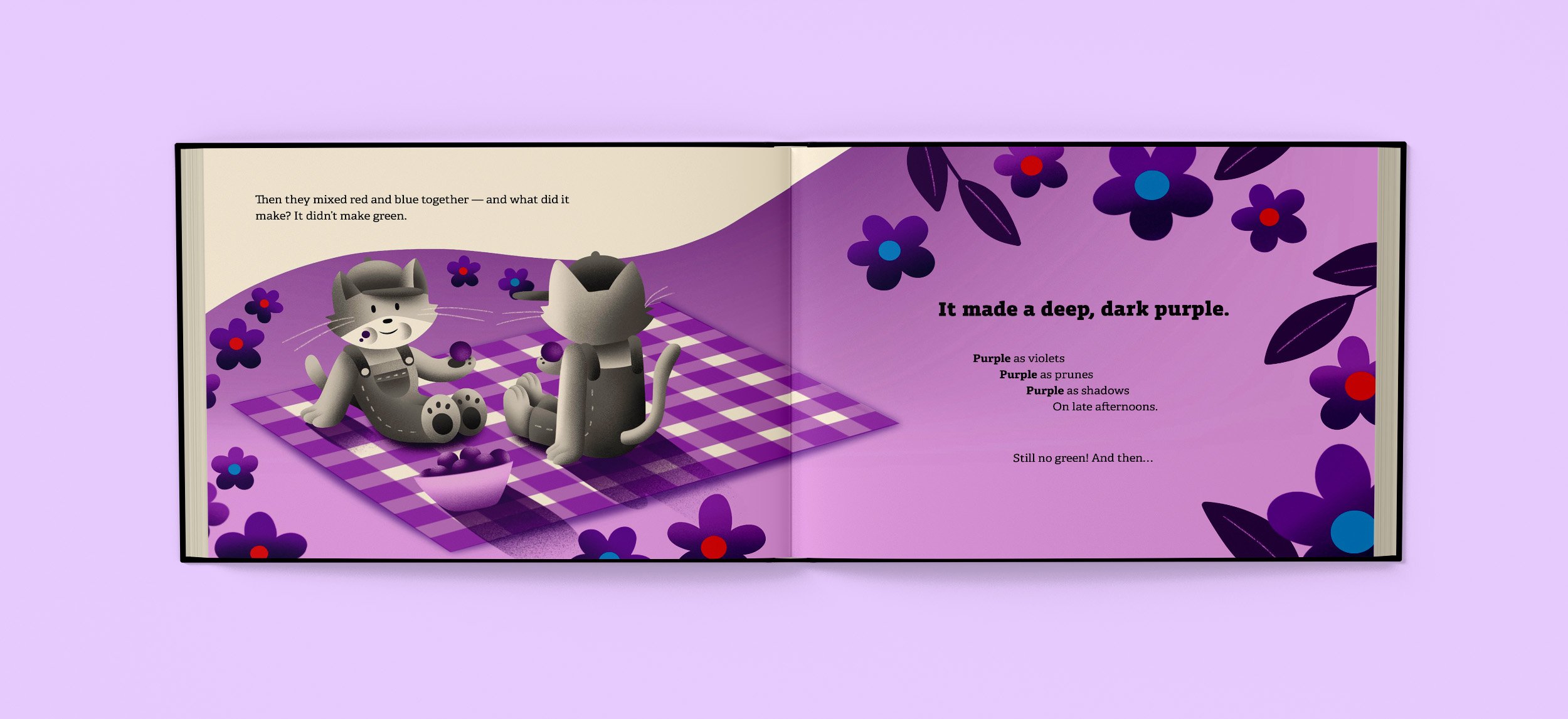
Tasked with designing twelve interior spreads, a title page, endpapers, and a front and back cover, my version of The Color Kittens uses colorful, full-spread illustrations as a form of visual storytelling, coupled with dynamic layout design and typesetting choices to create an educational, yet playful approach to learning about colors.
Research:
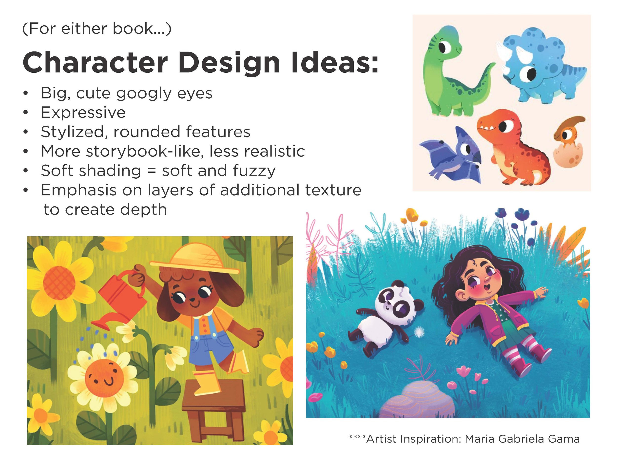
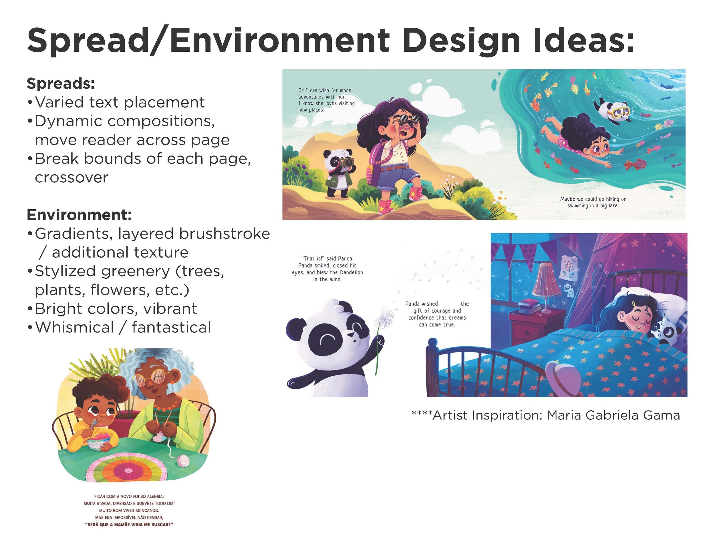
Before beginning the initial design process, I researched children's book illustrations and layout designs that I found most appealing. First published in 1949, the design of the original The Color Kittens was somewhat dated, so I wanted to put a contemporary spin on the visuals of the children's book classic. Therefore, in my research, I was mainly searching for contemporary book designers and illustrators who utilized the space on each page in new, inventive ways. One of my biggest inspirations throughout this process was the work of Brazilian illustrator Maria Gabriela Gama. I specifically admired Gama's approach to layout design which allowed for type and image to play with one another, creating a series of dynamic, full-spread designs.
Storyboards & Sketches:
Pacing was crucial in the early storyboarding stages, as I wanted my layout design to vary between full-spread illustrations and single-page illustrations. With the turn of each page, my goal was to surprise the reader by using a different compositional approach in each spread while still maintaining a stylistic and hierarchical consistency.
Early Character Exploration:
Type & Layout Design:
Constructed in Adobe InDesign, I experimented with different combinations of type and image to create a series of visually dynamic compositions that effectively captured the playful quality of Brown's writing. Using paragraph and character styles, I created a system of typographical hierarchy that was consistent and effective in matching the book's tone and illustrations.


Colors & Illustrations:
With a title like The Color Kittens, color played a huge role in the overall design of the book. When it came to the illustrations, it was important that the physical process of mixing each color was included as a visual tool to help guide young readers in their understanding of color mixing. Since I was working with such a wide range of heavily saturated color, I made the decision to print the book on an off-white paper stock to mute and unify the colors somewhat cohesively.


Conclusion:
While recreating my take on The Color Kittens, I learned to value the technical precision of publication and print design. Among the project’s many challenges, each decision I made regarding the type, font choice, illustrations, and color usage directly impacted the visual successes of one another. Finding the harmony between each design component was extremely rewarding, and I couldn't be prouder of the final product. I want to extend a special thank you to my professor, Paul Kepple, for his role in guiding me throughout the entire design process.


